ShopDreamUp AI ArtDreamUp
Deviation Actions


Description
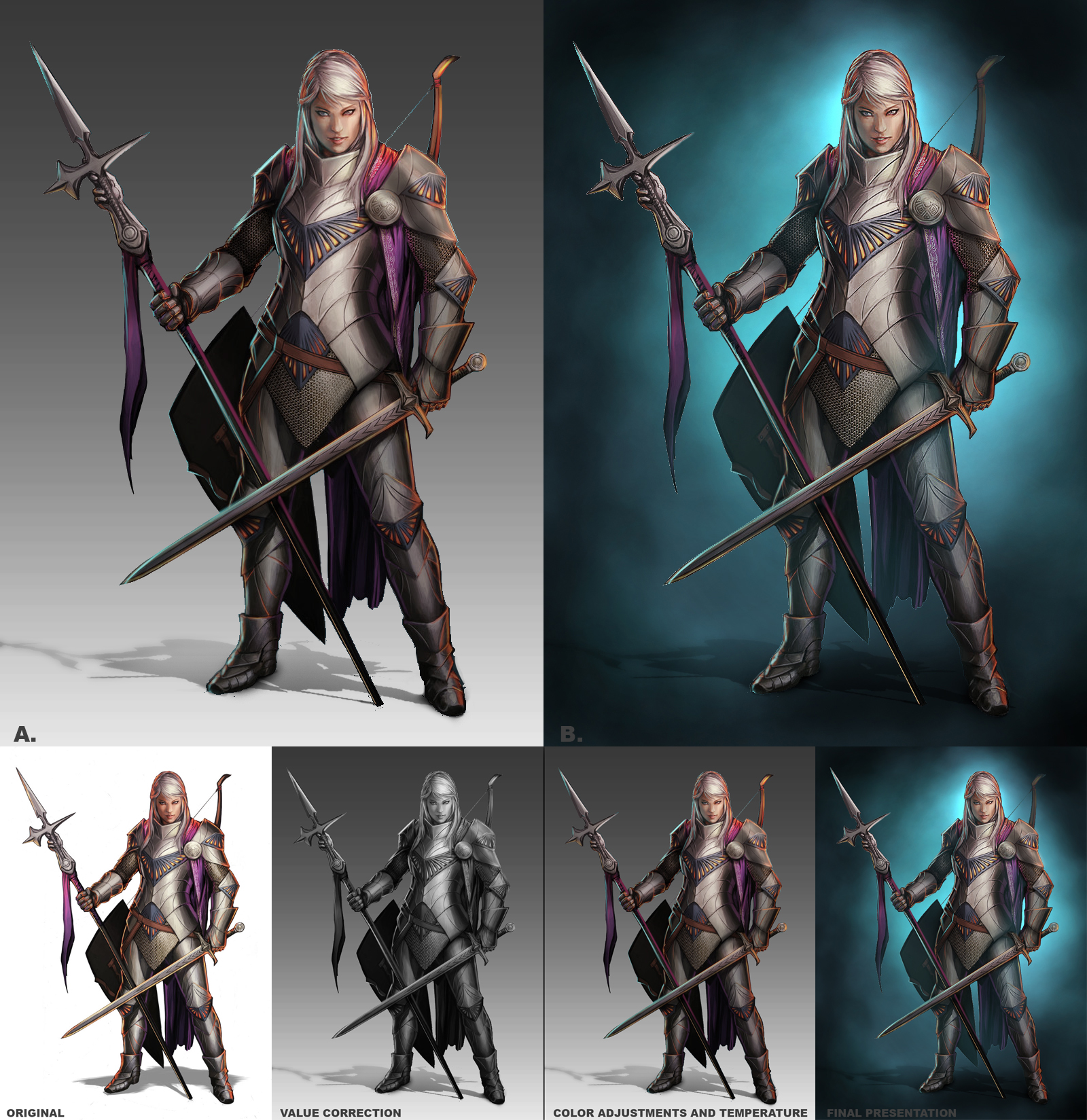
Earlier today I had an opportunity to chat with my good buddy  and exchange methods, tips and techniques. To demonstrate some of my methods, I used one of his images, Kavina comm, a commission for
  . I also provided a paintover with some quick corrections, and two different possibilities for a final presentation. By no means is this meant to be a super-refined repaint, just something quick to show my friend under time constraints. This image is posted with permission from the artist, and shared for educational purposes with the process below. It is a little long-winded but I tried to be thorough in the interest of education, so I hope it helps.
  (Smile)")
If the anatomy and perspective on an image are alright but something still looks wrong, the first step I always take when I provide critiques or paintovers is to look at the values. It is very iportant to always be mindful of your primary light source. If you want to add in multiple light sources, make sure you take care of your primary light source first and then deal with the rest of your lighting one light source at a time. Your primary light source will always be more powerful and your others should be incrementally weaker. Remember that surfaces which are perpendicular to the light source will always receive more light than those turning away from the light source. Try thinking of your image with having a dark side and a light side. Your lightest areas of your dark side should never be as bright as the darkest areas on your light side. Also remember that the power of a light source diminishes as objects travel further away from it. In terms of painting characters with a top-down light source (e.g. the sun), this means that the upper body and head will be brighter than the legs, creating a natural gradient from light to dark, splitting the upper and lower body into a light side and dark side. Doing this will help give your image depth, save your forms from flattening out, help define focal points around areas of attention (in this case, the pretty gal's face) and make you one with the Force.
Another important thing to bear in mind is that values look brighter or darker than they really are depending on what's immediately around them. In color theory, this is called color relativity, and in value you can make things pop and call attention to elements by putting something brighter right next to something that's much darker. This creates contrast and is how you get depth in value. Since the body has a top-down gradient going from light to dark, I add in a background gradient going from dark to light. Finally, I add in the drop shadow and skew it in perspective, making sure to fuzz it out and lighten it up as it recedes off in the distance from the figure, and toss in some ambient occlusion (the darkest darks where light gets trapped between two objects) beneath her feet so it feels like she's standing on a surface rather than floating there.
Simply put, it basically does this. Against a white backdrop, the gray around the head there actually looks pretty dark, but against a darker backdrop it pops out and looks lighter than it really is.
It's also helpful to use mid-toned backgrounds (around 50% gray or so) when you draw or paint for several other reasons: 1) bright white is a killer on the eyes when you're painting, 2) having extreme dark or light backgrounds can throw off your value sense, causing you to paint darker or lighter than you think you are, 3) it's very distracting for the viewer, because our eyes are drawn to areas of contrast and extremely dark or light backgrounds can throw off your audience from focal points, and 4) it just looks more presentable that way, 'specially with a flashy gradient")
At this stage, I should be able to see my values clearly and whether or not they are working. I make sure that my cast and form shadows are creating the right amount of depth and are being cast in the right places. Once I get them to a satisfactory level, I try to use a little bit of rim light to accent areas which may otherwise be drowned out in darkness. This helps suggest the forms and adds in another element of depth. Rim light comes from behind and wraps around the form, so it can be brighter than your secondary or tertiary light sources, especially for a nice, dramatic effect.
Now, if I were doing a tight grayscale render commission, this is probably where I'd stop. If I wanted to do anything more, I'd probably just toss in a very slight vignette to darken the corners and call more attention to the figure, and touch up the lighting as much as possible. However, for a color commission, I'd paint overtop this further. You might have found in your own photoshop exploits that simply washing color over grayscale using the "color" layer blend mode results in a really washed-out looking image. This is because you are just adding hue to value, and color has many more properties than this, including chroma. Materials also possess their own properties which can affect both color and value. You can use the color layer as a base but you will inevitably have to do more work overtop of it, which is a bit of a time investment. You might think it's a time-saver to work straight into color, but you run the risk of messing up your values if you aren't super-knowledgeable about color theory and how to maintain your values, colors and material properties simultaneously. It's not impossible, just more difficult, hence why design schools tend to teach value first, because getting that right earlier makes the rest of your work less of a nightmare. Just bear this in mind.
At the end of the color phase, I like to make sure I have a good balance of color temperature. You can use a neutral light source, but your end result will look a lot more bland and less vibrant compared to using either a warm or cool light source. In this case, I opted for a warm light source, which means cool shadows. I added a bright blue to the rim light with a hard brush set to Linear Dodge to offset the oranges on the lit side for a nice color contrast.
This on its own is pretty presentable. Everything reads and the background isn't super distracting. This would be pretty OK for what I'd do for a color commission with no background, but I like to push my own expectation level so there's one more thing I can do.
At this phase I add in a color backdrop with a vignette. This takes all of two seconds to do so it's not the kind of thing I'd charge extra for. It looks super pretty, but it doesn't always work out, depending on the image, so I tend to go with whatever works best for the end result. Sometimes, the cloudy background looks better in gray, sometimes it doesn't. The Now, in the simple gradient version A, one thing I could have done is added in some atmospheric perspective to push some of the forms back (making elements receding further in the distance lighter than those closer). Since I knew I was going to do version B and volumetric fog is dependent on the color of what's behind the figure, changing it from gray to the right gradation of blue would've just been a pain in the ass to deal with (not impossible, just a minor annoyance I didn't feel like dealing with), so I waited until I had right color tones in place.
If this were my image and I were doing this for a client, I'd polish it much further and do a few more things to make it sing, but in the interest of time and just giving my friend a general idea of my workflow, this is how far I got. There are a few more bells and whistles I usually like to add in for my character work for no extra charge, but only if it serves the image instead of creating a distraction. In this character's case, I might add in a rock texture for the ground plane, similar to what did for his Substrata - Judge piece, and a few more adjustments and refinements to really give it life.
I hope this helps some of you in your character work. Feel free to like, share, ask questions, etc.
and exchange methods, tips and techniques. To demonstrate some of my methods, I used one of his images, Kavina comm, a commission for . I also provided a paintover with some quick corrections, and two different possibilities for a final presentation. By no means is this meant to be a super-refined repaint, just something quick to show my friend under time constraints. This image is posted with permission from the artist, and shared for educational purposes with the process below. It is a little long-winded but I tried to be thorough in the interest of education, so I hope it helps. If the anatomy and perspective on an image are alright but something still looks wrong, the first step I always take when I provide critiques or paintovers is to look at the values. It is very iportant to always be mindful of your primary light source. If you want to add in multiple light sources, make sure you take care of your primary light source first and then deal with the rest of your lighting one light source at a time. Your primary light source will always be more powerful and your others should be incrementally weaker. Remember that surfaces which are perpendicular to the light source will always receive more light than those turning away from the light source. Try thinking of your image with having a dark side and a light side. Your lightest areas of your dark side should never be as bright as the darkest areas on your light side. Also remember that the power of a light source diminishes as objects travel further away from it. In terms of painting characters with a top-down light source (e.g. the sun), this means that the upper body and head will be brighter than the legs, creating a natural gradient from light to dark, splitting the upper and lower body into a light side and dark side. Doing this will help give your image depth, save your forms from flattening out, help define focal points around areas of attention (in this case, the pretty gal's face) and make you one with the Force.
Another important thing to bear in mind is that values look brighter or darker than they really are depending on what's immediately around them. In color theory, this is called color relativity, and in value you can make things pop and call attention to elements by putting something brighter right next to something that's much darker. This creates contrast and is how you get depth in value. Since the body has a top-down gradient going from light to dark, I add in a background gradient going from dark to light. Finally, I add in the drop shadow and skew it in perspective, making sure to fuzz it out and lighten it up as it recedes off in the distance from the figure, and toss in some ambient occlusion (the darkest darks where light gets trapped between two objects) beneath her feet so it feels like she's standing on a surface rather than floating there.
Simply put, it basically does this. Against a white backdrop, the gray around the head there actually looks pretty dark, but against a darker backdrop it pops out and looks lighter than it really is.
It's also helpful to use mid-toned backgrounds (around 50% gray or so) when you draw or paint for several other reasons: 1) bright white is a killer on the eyes when you're painting, 2) having extreme dark or light backgrounds can throw off your value sense, causing you to paint darker or lighter than you think you are, 3) it's very distracting for the viewer, because our eyes are drawn to areas of contrast and extremely dark or light backgrounds can throw off your audience from focal points, and 4) it just looks more presentable that way, 'specially with a flashy gradient
At this stage, I should be able to see my values clearly and whether or not they are working. I make sure that my cast and form shadows are creating the right amount of depth and are being cast in the right places. Once I get them to a satisfactory level, I try to use a little bit of rim light to accent areas which may otherwise be drowned out in darkness. This helps suggest the forms and adds in another element of depth. Rim light comes from behind and wraps around the form, so it can be brighter than your secondary or tertiary light sources, especially for a nice, dramatic effect.
Now, if I were doing a tight grayscale render commission, this is probably where I'd stop. If I wanted to do anything more, I'd probably just toss in a very slight vignette to darken the corners and call more attention to the figure, and touch up the lighting as much as possible. However, for a color commission, I'd paint overtop this further. You might have found in your own photoshop exploits that simply washing color over grayscale using the "color" layer blend mode results in a really washed-out looking image. This is because you are just adding hue to value, and color has many more properties than this, including chroma. Materials also possess their own properties which can affect both color and value. You can use the color layer as a base but you will inevitably have to do more work overtop of it, which is a bit of a time investment. You might think it's a time-saver to work straight into color, but you run the risk of messing up your values if you aren't super-knowledgeable about color theory and how to maintain your values, colors and material properties simultaneously. It's not impossible, just more difficult, hence why design schools tend to teach value first, because getting that right earlier makes the rest of your work less of a nightmare. Just bear this in mind.
At the end of the color phase, I like to make sure I have a good balance of color temperature. You can use a neutral light source, but your end result will look a lot more bland and less vibrant compared to using either a warm or cool light source. In this case, I opted for a warm light source, which means cool shadows. I added a bright blue to the rim light with a hard brush set to Linear Dodge to offset the oranges on the lit side for a nice color contrast.
This on its own is pretty presentable. Everything reads and the background isn't super distracting. This would be pretty OK for what I'd do for a color commission with no background, but I like to push my own expectation level so there's one more thing I can do.
At this phase I add in a color backdrop with a vignette. This takes all of two seconds to do so it's not the kind of thing I'd charge extra for. It looks super pretty, but it doesn't always work out, depending on the image, so I tend to go with whatever works best for the end result. Sometimes, the cloudy background looks better in gray, sometimes it doesn't. The Now, in the simple gradient version A, one thing I could have done is added in some atmospheric perspective to push some of the forms back (making elements receding further in the distance lighter than those closer). Since I knew I was going to do version B and volumetric fog is dependent on the color of what's behind the figure, changing it from gray to the right gradation of blue would've just been a pain in the ass to deal with (not impossible, just a minor annoyance I didn't feel like dealing with), so I waited until I had right color tones in place.
If this were my image and I were doing this for a client, I'd polish it much further and do a few more things to make it sing, but in the interest of time and just giving my friend a general idea of my workflow, this is how far I got. There are a few more bells and whistles I usually like to add in for my character work for no extra charge, but only if it serves the image instead of creating a distraction. In this character's case, I might add in a rock texture for the ground plane, similar to what
did for his Substrata - Judge piece, and a few more adjustments and refinements to really give it life. I hope this helps some of you in your character work. Feel free to like, share, ask questions, etc.
Image size
1600x1649px 1.35 MB
© 2014 - 2024 katmachiavelli
Comments0
Join the community to add your comment. Already a deviant? Log In